Green Prairie Farms
ABOUT
Green Prairie Farms is a Cannabis grow specializing in growing in organic living soil.
BRAND DEVELOPMENT
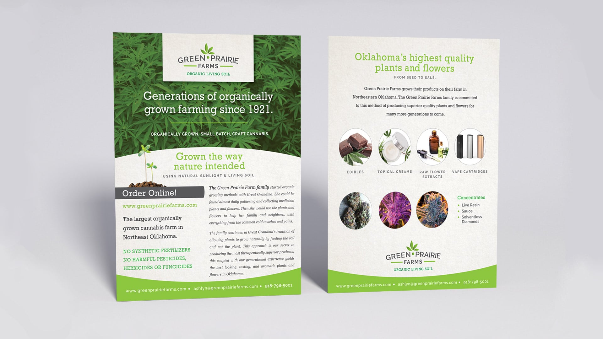
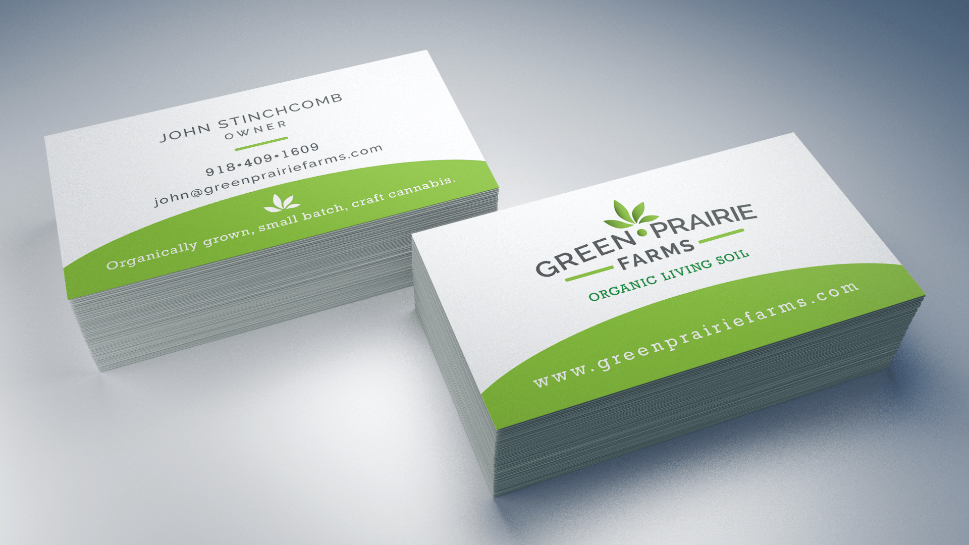
The Green Prairie Farms logo was designed with the idea of a small organic farm in mind. They wanted to stay away from the often overused cannabis leaf motif, yet still portray the idea of small leaves growing into a healthy plant. A combination of lime green, dark green and a dark grey color pallet was paired with a crisp white white background throughout their branding to give a clean fresh feeling. The result is a friendly logo which was then used in many different formats for brand consistency from business cards, to brochures, to signage.
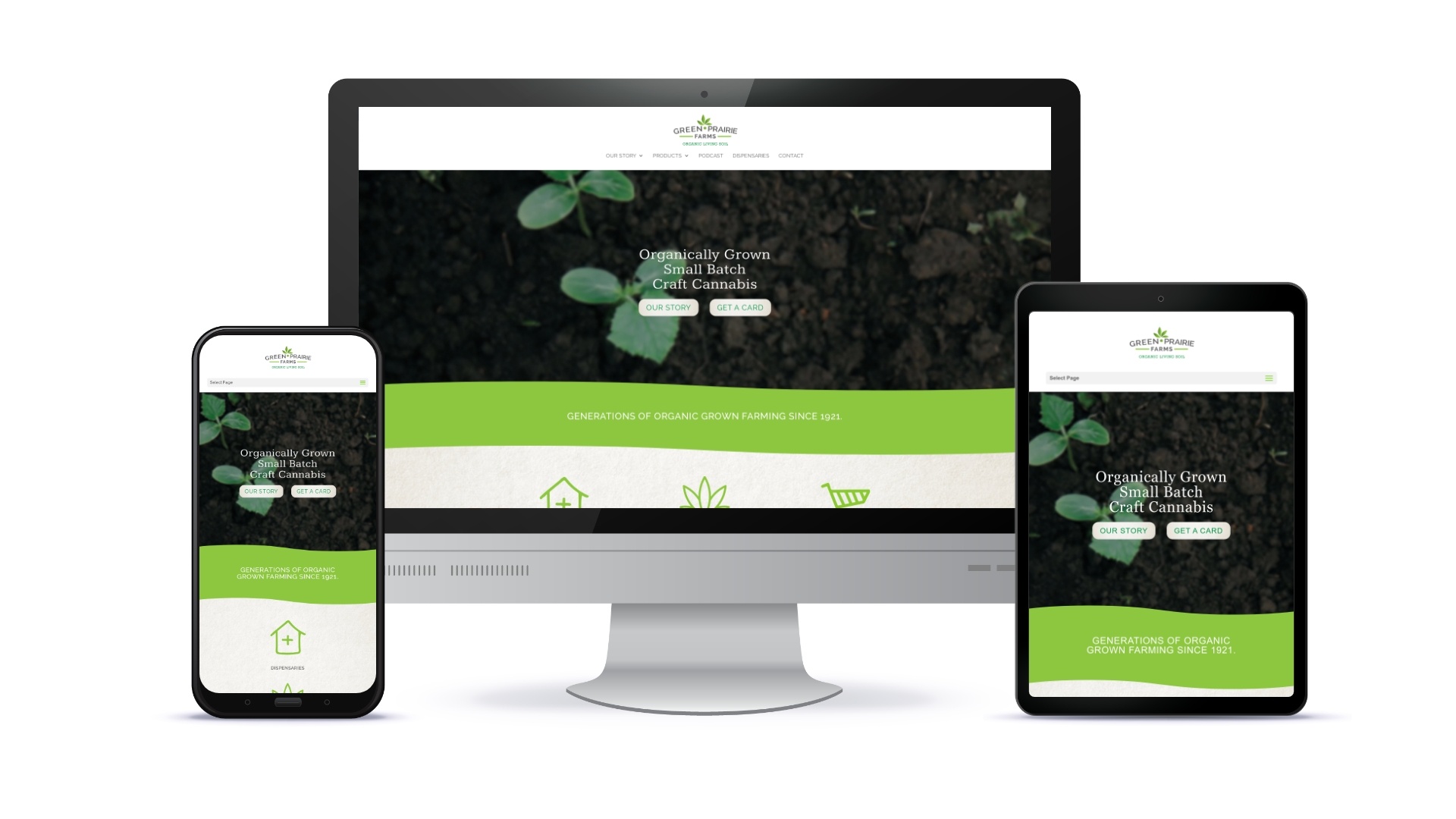
WEBSITE DESIGN | www.greenprairiefarms.com
The goal of the Green Prairie Farms website was to look less “marjiuana” and focus more on growing in organic living soil on “grandma’s farm.”
Results: The Green Prairie Farms website gets leads every day coming through from the SEO efforts that the D2 team established early on when cannabis first passed in Oklahoma. They have been able to secure many partners and dispensaries through their website.
VIDEO PRODUCTION
Green Prairie’s brand story video was developed to use for marketing and on their website to build trust for potential customers about their process and their product. They are experts in their field and we wanted to project that through video.


